Home/Blogs & Insights/What Makes a High-Converting Website in 2026? The Anatomy of a Website Built to Generate Revenue
Web Development
What Makes a High-Converting Website in 2026? The Anatomy of a Website Built to Generate Revenue
A high-converting website is not a digital brochure. Learn the Revenue Website Stack, the seven layers that determine whether your site turns traffic into leads, appointments, and sales.
Vince Beekel
Jul 17, 202613 min read
Table of Contents
Most business owners judge their website the way they judge a brochure. Does it look professional? Does it mention the right services? Is the logo prominent? These are reasonable questions for a printed flyer. They are the wrong questions for a system that is supposed to generate revenue.
A high-converting website is not a digital display case. It is a sequence of decisions, signals, and technical connections designed to move a stranger from discovery to action. The difference between a website that converts and one that does not is rarely about aesthetics. It is about architecture, messaging clarity, trust signals, conversion paths, and the technical infrastructure that connects visibility to business outcomes.
This article breaks down what actually makes a website convert visitors into leads, appointments, and sales. For the broader framework of how discovery, websites, and measurement connect, read our guide to Multi-Engine Optimization. To audit whether your current site has structural problems, see our 12 signs your website is costing you leads.
What Is a High-Converting Website?
A high-converting website is a site engineered to turn a percentage of its visitors into measurable business actions: phone calls, form submissions, appointment bookings, quote requests, or purchases. Conversion is not a single element. It is the cumulative result of discovery, clarity, trust, path design, the conversion mechanism itself, follow-up, and measurement. A site that looks polished but lacks any of these layers will underperform regardless of how much traffic it receives.
Conversion rate optimization, or CRO, is the practice of improving each layer so that a higher percentage of visitors complete a desired action. But CRO is often discussed as if it means changing button colors and shortening forms. Those are tactics. The system underneath the tactics is what determines whether the tactics matter.
The Revenue Website Stack
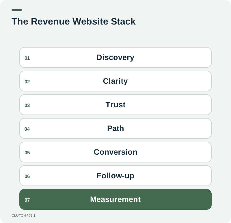
Clutch organizes the components of a high-converting website into seven connected layers. Each layer builds on the one before it. A weakness at any level weakens the entire stack, which is why improving one layer in isolation often produces disappointing results.
The Revenue Website Stack: seven layers that determine whether a website converts traffic into revenue.
Level 1: Discovery
Can qualified prospects find the website? Discovery includes organic search visibility, paid traffic, direct visits, referrals, and AI search appearances. A beautiful website that no one discovers cannot convert. Discovery is the foundation, and it is where SEO, search advertising, and AI search visibility matter most. If your site is not discoverable, every layer above it is wasted.
Level 2: Clarity
Once a visitor arrives, can they immediately understand who you help, what you do, and why it matters? Clarity is about messaging, not design. A visitor should know within seconds what your company offers and whether it is relevant to their situation. Confusing value propositions, vague headlines, and industry jargon all break this layer. If a visitor cannot articulate what you do after reading your hero section, the clarity layer has failed.
Level 3: Trust
Does the website provide enough evidence to reduce uncertainty? Trust signals include reviews, testimonials, case studies, certifications, professional affiliations, team photos, and transparent business information. Trust is especially important for high-value services where the decision involves risk. A visitor who is interested but not convinced will leave without acting. Trust bridges the gap between interest and action.
Level 4: Path
Can visitors easily determine what to do next? Path design is about navigation, page hierarchy, and calls to action. A visitor who wants to act but cannot find the form, the phone number, or the booking page will abandon the effort. Path design means creating clear, frictionless routes from interest to action. Every page should have an obvious next step, and that step should require minimal effort to complete.
Level 5: Conversion
Can visitors actually complete the action? The conversion mechanism is the form, the phone call, the booking calendar, the checkout, or the quote request. It needs to be functional, accessible on mobile, and as short as reasonably possible. A form with twelve required fields when three would suffice creates friction. A phone number that is not clickable on mobile blocks mobile users. A booking calendar that requires account creation adds a barrier. The conversion layer is where friction kills momentum.
Level 6: Follow-Up
Does the website connect into CRM, SMS, email, AI agents, or sales workflows? Follow-up is what happens after the form is submitted or the call is made. If a lead enters a form and sits in an inbox for three hours, the conversion was wasted. A high-converting website connects immediately to the systems that handle lead routing, response, nurturing, and sales follow-up. This is where website infrastructure meets sales infrastructure. For businesses exploring AI-powered follow-up, our AI Sales Agents provide one approach to automated response and qualification.
Level 7: Measurement
Can the business determine which traffic sources and pages generated revenue? Measurement closes the loop between discovery and business outcomes. Without it, you cannot know which pages convert, which traffic sources produce qualified leads, or which improvements moved the needle. Measurement includes analytics, call tracking, CRM attribution, and conversion tracking configured to connect actions to revenue rather than just counting clicks.
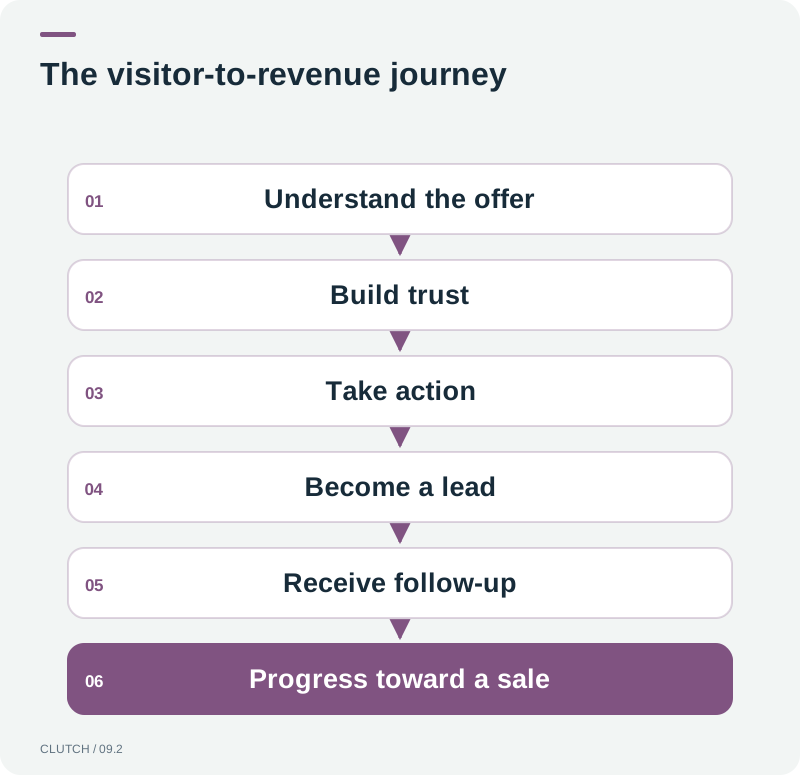
The visitor-to-revenue journey: each stage represents a point where prospects can drop off or advance.
What Should a High-Converting Homepage Do in the First 10 Seconds?
The first ten seconds of a visit are not about impressing a visitor with design. They are about answering three questions: Am I in the right place? Does this company solve my problem? What should I do next? A homepage that answers these questions quickly reduces bounce and moves visitors deeper into the site. A homepage that delays these answers with auto-playing videos, splash screens, or vague taglines forces visitors to work harder than they will.
The hero section, the area visible without scrolling, should contain a clear headline that states what the business does, a subheadline that specifies who it helps, and a primary call to action that is visually distinct. The phone number should be visible. The value proposition should be concrete, not aspirational. Visitors do not read hero sections. They scan them. Design for scanning, not reading.
What Should Appear Above the Fold?
Above the fold is the portion of the page visible without scrolling on a standard desktop or mobile screen. This area should contain your clearest value proposition, a primary call to action, and enough visual context to orient the visitor. It should not contain carousels that rotate before a visitor can read them, because rotating banners force visitors to wait for information rather than presenting it immediately. Static, clear, and purposeful beats clever and animated for conversion.
How Many CTAs Should a Page Have?
A page should have one primary call to action and optionally one or two secondary actions. The primary CTA is the action you most want the visitor to take. The secondary CTAs provide alternatives for visitors who are not ready for the primary action but might engage differently. For example, a service page might have Book a Consultation as the primary CTA and Learn More and Call Us as secondary options. Pages with five CTAs of equal visual weight confuse visitors by making every action seem equally important, which means none of them stand out.
Are Pop-Ups Good or Bad for Conversion?
Pop-ups are neither inherently good nor bad. They are tools, and their effect depends on timing, relevance, and intrusiveness. A pop-up that appears immediately on page load interrupts the visitor before they have context, which increases bounce. A pop-up that appears after a visitor has scrolled through 60 percent of a page or spent thirty seconds reading offers something relevant to an engaged user. The distinction is between interruption and invitation. Pop-ups that offer genuine value, such as a relevant guide or a discount tied to the page content, can improve conversion. Pop-ups that interrupt without context tend to damage it.
How Long Should Lead Forms Be?
Lead forms should be as short as possible while collecting the information needed to respond meaningfully. For most service businesses, a form needs three to five fields: name, contact information, and one qualifying field. Each additional field reduces submission rates. The instinct to collect more information upfront is understandable, but it trades quantity for quality of opportunity. It is more valuable to capture a lead with minimal information and qualify through follow-up than to lose the lead entirely because the form felt like an interview.
Multi-step forms, which break a longer process into two or three short steps, can sometimes capture more information without the friction of a long single-page form. The psychology is that once a visitor commits to the first step, they are more likely to complete subsequent steps. Test this rather than assuming one approach works universally.
Should Pricing Be Displayed?
Whether to display pricing depends on the business model, the price point, and the sales process. Ecommerce businesses should display pricing because the transaction is self-serve. Service businesses with standardized packages benefit from displaying starting prices or ranges because it pre-qualifies visitors and reduces unqualified inquiries. Professional services with custom pricing benefit from explaining their pricing approach, such as project-based or retainer, without quoting specific numbers that may not apply to a specific situation.
Hiding pricing entirely without explanation creates friction. Visitors who cannot find pricing information may assume the service is too expensive, may leave to check competitors, or may call to ask and then feel pressured by a sales conversation they were not prepared for. Transparency about the pricing model, even without exact numbers, reduces uncertainty and keeps qualified prospects engaged.
Does Page Speed Affect Conversion?
Yes. Page speed affects both search visibility and conversion. Google's PageSpeed Insights and Core Web Vitals documentation indicate that loading performance, interactivity, and visual stability are part of the page experience signals Google considers. Slow pages increase bounce rates, especially on mobile devices where network conditions vary. A page that takes five seconds to load on a mobile connection will lose visitors who would have converted if the page loaded in two seconds.
The practical approach is to measure page speed using Google PageSpeed Insights, identify the specific issues slowing the page, and address them systematically. Common issues include large unoptimized images, render-blocking JavaScript, excessive third-party scripts, and slow server response times. Fixing these issues improves both conversion and search visibility simultaneously, which makes page speed one of the few optimizations that serves multiple goals at once.
How Should Mobile Conversion Differ?
Mobile conversion should not differ in intent but in execution. Mobile users have less screen space, different interaction patterns, and different network conditions. Forms should be shorter on mobile, with larger touch targets and autofill support. Phone numbers should be clickable. Navigation should be accessible without obscuring content. The entire conversion path should be testable by thumb on a phone held in one hand.
Mobile is not a secondary consideration. For many service businesses, the majority of traffic arrives on mobile devices. A website that converts well on desktop but poorly on mobile is losing the majority of its opportunities. Test every conversion path on an actual mobile device, not just in a responsive preview window. The difference between a responsive layout that looks correct and a mobile experience that converts well is significant.
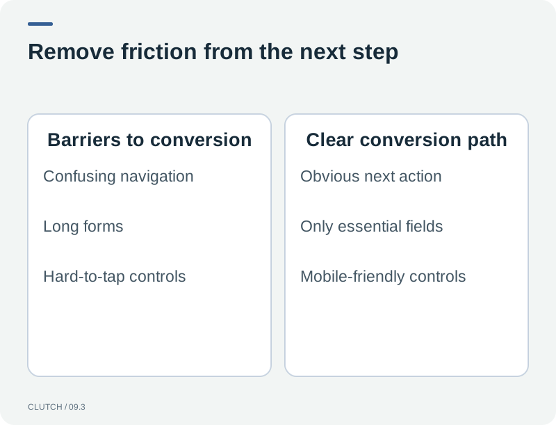
Conversion friction: barriers in the path prevent visitors who intended to act from completing the action.
What Should Happen After a Form Submission?
The moment a visitor submits a form is the highest-value moment in the conversion process. What happens next determines whether that lead becomes a customer. The visitor should see a confirmation page that acknowledges their submission and sets expectations for what happens next. Simultaneously, the lead should enter a CRM or sales workflow that triggers an immediate response.
Speed to lead matters. A lead that receives a response within minutes is more likely to convert than one that receives a response within hours. This is where website infrastructure meets sales infrastructure. The form submission should trigger a notification to the sales team, an automated email to the lead, and potentially a text message or AI-powered follow-up. If the form submission enters a queue that a human checks twice a day, the conversion advantage of a fast website is wasted by a slow sales process. For a deeper look at this connection, read about the differences between smart websites and traditional websites.
How Should Website Conversion Be Measured?
Conversion measurement should track actions that connect to business outcomes, not just page views. Configure conversion tracking for form submissions, phone calls, booking confirmations, and purchases. Connect these actions to revenue where possible. Use call tracking to attribute phone calls to specific pages and traffic sources. Set up CRM integration so that leads from the website are attributed to their source and tracked through the sales process.
Avoid vanity metrics. Page views, time on page, and bounce rate provide context but do not measure conversion. The metrics that matter are conversion rate by traffic source, cost per lead by channel, lead quality score, and revenue attributed to website-generated leads. A website with high traffic and a 0.5 percent conversion rate is producing fewer leads than a website with moderate traffic and a 4 percent conversion rate. Focus your reporting on the metrics that connect to revenue.
The High-Converting Website Checklist
Use this checklist to evaluate whether your website is built to convert. Not every item applies to every business, but the list reflects the most important elements of a revenue-generating website.
Hero section states what the business does, who it helps, and includes a primary CTA
Value proposition is specific and concrete, not vague or aspirational
Phone number is visible, clickable on mobile, and tracked through call tracking
Primary call to action is visually distinct and repeated at logical points on the page
Lead forms require only the information needed to respond, with no unnecessary fields
Trust signals are present: reviews, testimonials, case studies, or professional credentials
Service pages explain what the service includes and what the next step is
Mobile experience is tested on actual devices, not just responsive preview
Page speed scores are acceptable in Google PageSpeed Insights for primary landing pages
Confirmation pages or messages acknowledge form submissions and set expectations
Lead submissions connect to CRM or sales workflow for immediate follow-up
Conversion tracking is configured for calls, forms, bookings, and purchases
Revenue attribution connects website leads to sales outcomes where possible
Navigation is clear and allows visitors to reach any service page within two clicks
FAQ section addresses common objections and questions that block conversion
Images are optimized for fast loading without sacrificing necessary quality
Every page has a clear next step, not a dead end
Frequently Asked Questions
Frequently Asked Questions
What is a good website conversion rate?
Conversion rates vary widely by industry, traffic quality, and what counts as a conversion. A site converting 2 to 5 percent of visitors into leads is reasonable for many service businesses. Rates above 5 percent are strong but depend on traffic quality and the specificity of the conversion action. The more useful benchmark is your own conversion rate over time, measured against your traffic sources and lead quality rather than against industry averages that may not reflect your situation.
Does a beautiful website design improve conversion?
Design quality matters but it is not the primary driver of conversion. A site can look polished and still fail to convert if the messaging is unclear, the trust signals are missing, or the conversion path has friction. Design supports conversion by creating credibility and guiding attention, but clarity, trust, and path design do the heavy lifting. Prioritize messaging and conversion infrastructure before visual refinement.
Should I use a pop-up to capture leads?
Pop-ups can capture leads but their effectiveness depends on timing and relevance. A pop-up that appears immediately interrupts the visitor before they have context. A pop-up that appears after engagement or offers something relevant to the page content can improve conversion. Test different approaches and measure whether the pop-up increases total conversions or merely shifts conversions that would have occurred anyway.
How many fields should a lead form have?
A lead form should have the fewest fields needed to respond meaningfully to the lead. For most service businesses, three to five fields are sufficient: name, email or phone, and one qualifying field. Each additional field reduces submissions. It is more effective to capture a lead with minimal information and qualify through follow-up than to lose the lead by requiring too much information upfront.
Does page speed really affect website conversion?
Yes. Page speed affects both conversion and search visibility. Slow pages increase bounce rates, particularly on mobile devices. Google's Core Web Vitals documentation identifies loading performance, interactivity, and visual stability as page experience factors. A page that loads slowly on mobile may lose visitors who would have converted if the page loaded faster. Measure your pages with PageSpeed Insights and address the specific issues identified.
What should I do after a visitor submits a form?
The lead should enter a CRM or sales workflow that triggers an immediate response. The visitor should see a confirmation page that acknowledges their submission. Simultaneously, your team should receive a notification and an automated email should go to the lead. Speed to lead matters: a response within minutes converts better than a response within hours. If the form enters a queue checked manually, the conversion advantage of the website is weakened by a slow sales process.
Should my website show pricing?
It depends on your business model. Ecommerce and standardized service packages benefit from displayed pricing because it pre-qualifies visitors. Custom professional services benefit from explaining the pricing approach without quoting specific numbers. Hiding pricing entirely without explanation creates friction. Transparency about the pricing model, even without exact figures, reduces uncertainty and keeps qualified prospects engaged.
How do I measure whether my website is actually generating revenue?
Configure conversion tracking for calls, forms, bookings, and purchases. Use call tracking to attribute phone calls to specific pages. Integrate your CRM so website leads are tracked through the sales process. Connect conversion data to revenue where possible. Report on conversion rate by traffic source, cost per lead, lead quality, and revenue attributed to website leads. Avoid vanity metrics like page views that do not connect to business outcomes.
Evaluate whether your website is actually built to convert traffic into revenue.
A high-converting website is a system, not a design. Clutch Digital Development builds websites engineered around discovery, clarity, trust, conversion, follow-up, and measurement so that visibility connects to business outcomes rather than stopping at page views.
What Could an AI Sales Agent Do for Your Business?
Every business handles leads differently. We'll look at your current sales process, lead volume, response times, follow-up, staffing, and opportunities to determine where an AI Sales Agent could have the biggest impact.
Traditional SEO reporting captures only one discovery environment. The Multi-Engine Visibility Audit measures seven categories of visibility, identifies blind spots, and connects discovery to business outcomes.
A Smart Website is connected to the systems that handle lead capture, qualification, routing, follow-up, and measurement. Learn the six capabilities that separate it from a traditional brochure site.
A website that looks acceptable can still be quietly losing leads through structural problems, technical gaps, and conversion friction. Use the Website Problem Severity Scale to diagnose what needs fixing.